ADISS — Brand Strategy · Brand Identity · Communication · Book Design
Be like water
A pioneer in the field, Adiss is Romania’s leading engineering firm dedicated to water. Serving hundreds of communities in the past 25 years, they’ve been taking part in the most ambitious projects around. Through this full-scale rebranding, we helped the team clarify their purpose and reaffirm their position as the go-to for water and wastewater treatment.
The work Adiss does is crucial, especially in a country where only half of the water is currently treated after use, the other half being thrown all dirty into the rivers. Inspired by water and engineering, the new identity replaces an outdated and generic look that gave no real clue as to what the firm does.
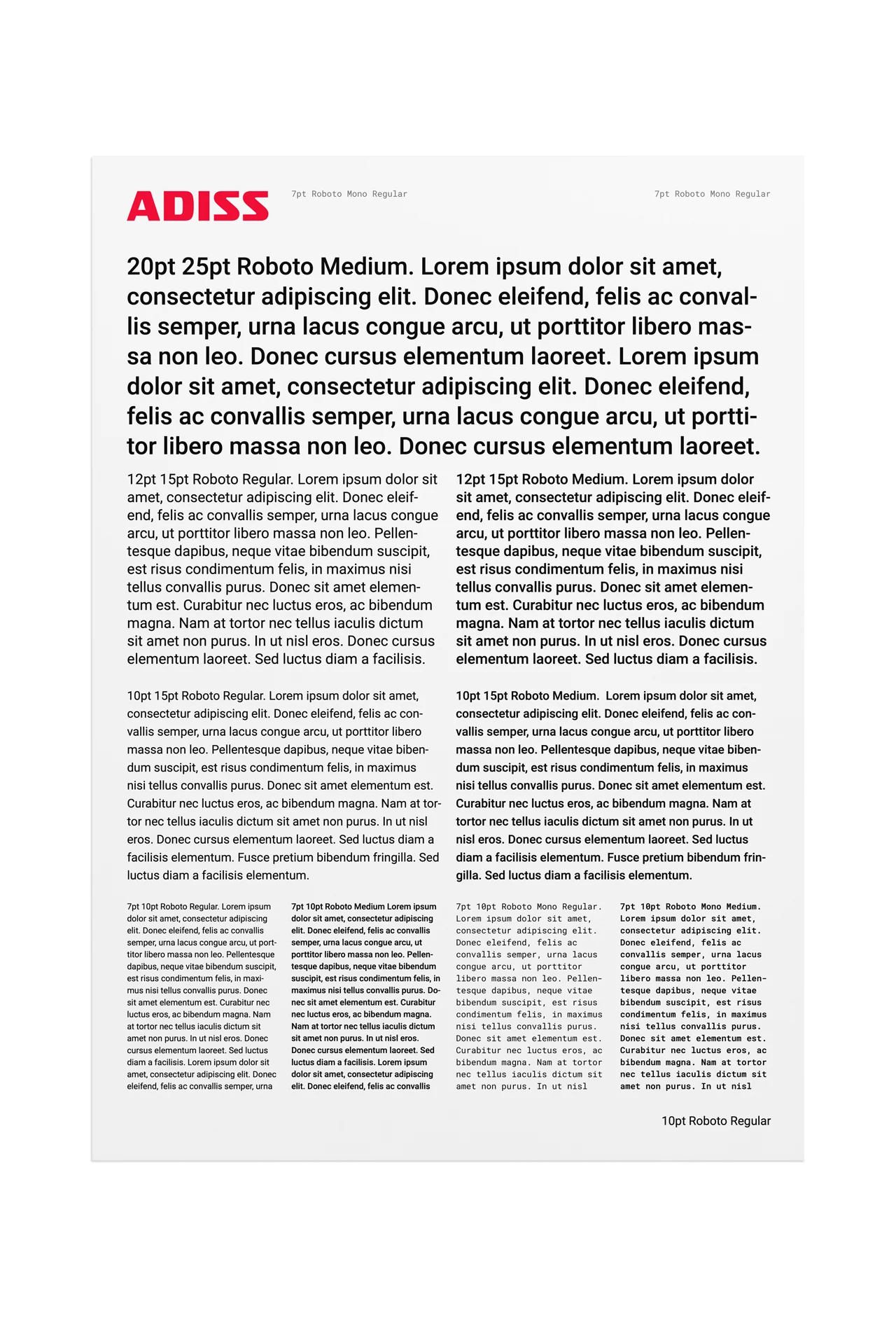
Set in Isotope, a typeface created by Hoefler&Co, the new Adiss wordmark conveys precision and reliability. The type resonates with the character of the brand: useful, well-built, honest and timeless. There is also a feeling of fluidity in the construction of the letters, through the variation of sharp and round corners.
The new color palette is clean and disciplined, suggesting the professional and technical nature of the job. White is for clean water and truthfulness. Deep blue is for engineering. Red is for vision and willpower, also connecting to the old identity. With nuances of light blue and grey, the secondary color palette brings more clues of water and stainless steel.
Brand idea as revealed in the anniversary book
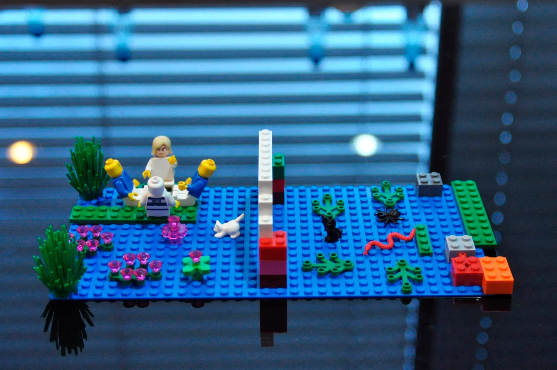
Brand discovery workshop using the Lego Serious Play® method, in collaboration with Nicoleta Marin
Responsibly shaping the future
Adiss is here to offer clients the vision to design sustainable solutions for water and wastewater treatment and the determination to build them. Vision and willpower combined played a major role in shaping the new identity, together with the supporting brand strategy. To begin with, it helped us confidently move on from the old symbol with no relevance to the water field.
Some other design decisions we made:
Drop the yellow because it does not inspire clean water.
Be very generous with the white for a clean look.
Use red in small proportions so as not to compete with the logo.
Introduce a monospaced font for an engineering feel.
Play with the slogan in size and proportion to make Adiss look powerful.

“The new brand identity completely represents our organisation, providing the foundation for modern communication. One of the most important outcomes is clarity, especially in understanding our purpose and values.”
Adiss 25
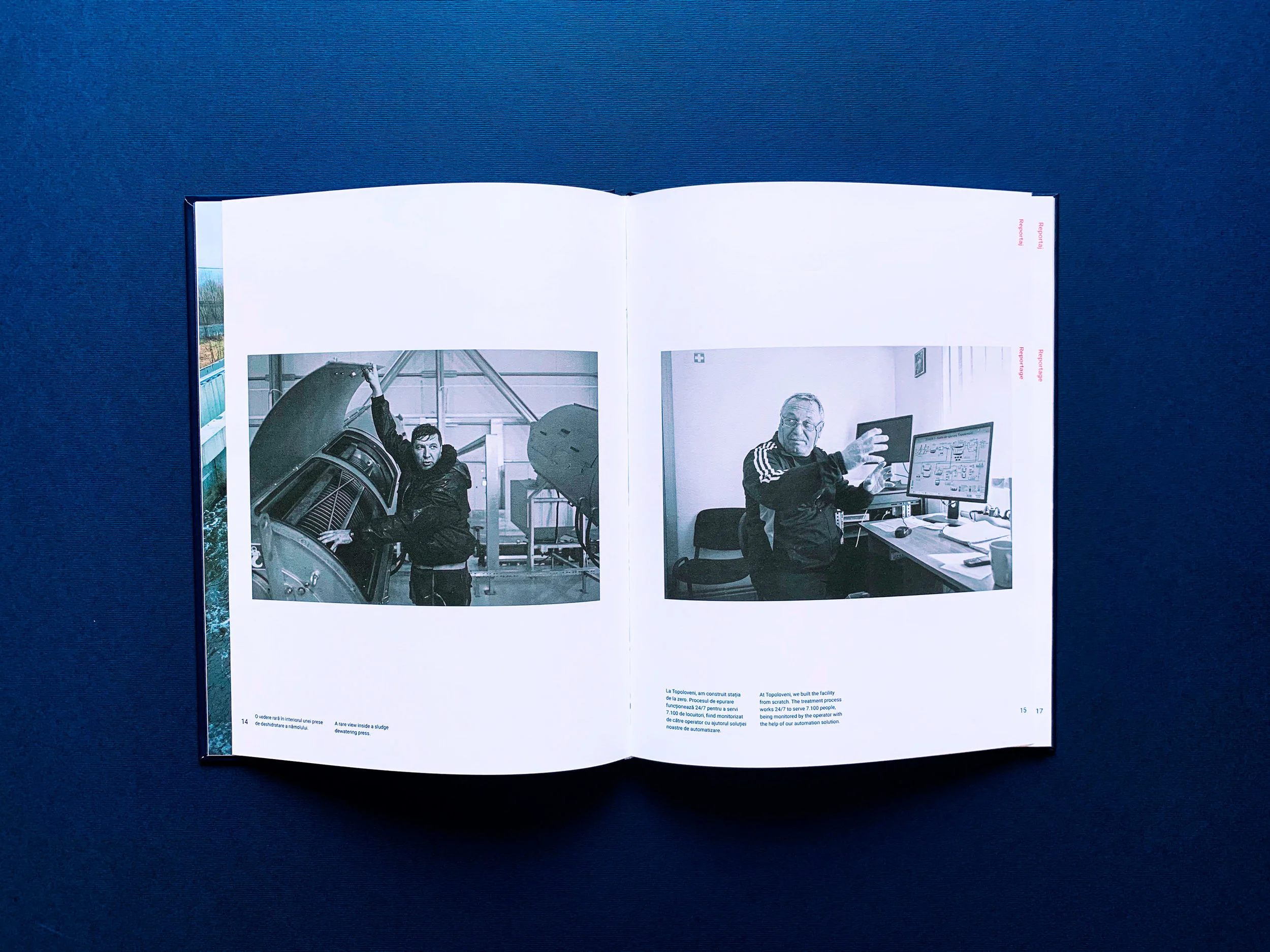
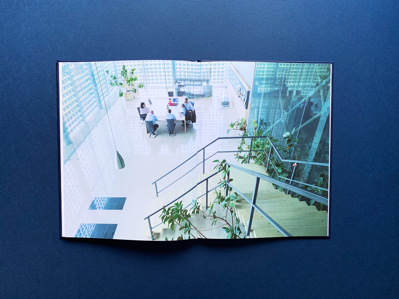
To celebrate 25 years of Adiss, we designed a book from scratch as a thank you to everyone who’s ever contributed to the firm’s evolution in time. We proposed a documentary approach to obtain authentic material — Adi Tudose took the expressive photos, we did all the planning, content and design. The shooting locations in our two-week roadtrip were the offices and production facility in Baia Mare and 4 wastewater treatment plants: Feldioara, Topoloveni, Costești and Tăuții-Măgherăuș.
Employees were involved in the creation of the book as well, contributing with content ideas for the history chapter and with some personal stories about their daily job at Adiss.


