DOCLANDIA — Naming · Brand Identity · UI/UX Design
The new place for care
Doclandia is the telemedicine platform which connects patients with the doctors they need, whenever they have a medical question to ask. Naming it was a true challenge, since it happened when the startup was just hatching. Going through hundreds of name options, we stopped at this one because it's direct, broad and easily relatable.
The logo has an appearance of trustworthiness, honesty and care. The ‘l’ with a curl at the bottom improves legibility. We placed the heart next to the ‘doc’ as a memorable twist which also helps shorten the wordmark to an app icon. Let's see how it works in the competitive landscape!
Modern medicine
About one year and a half after launch, we started working on the platform alongside Doclandia’s team of developers. The service was mature enough to be fine-tuned by our careful eyes and complex enough to be a challenge for us. We had to accommodate three types of consultations — video calls, appointments at the doctor’s office and home visits, plus a chat service on a subscription basis.
We helped define and design the entire user journey for both the patient and the doctor. Part of our work was actually product design, where we improved on the previous structure of the platform and brought in some new features that would make the experience smoother.
Patient experience
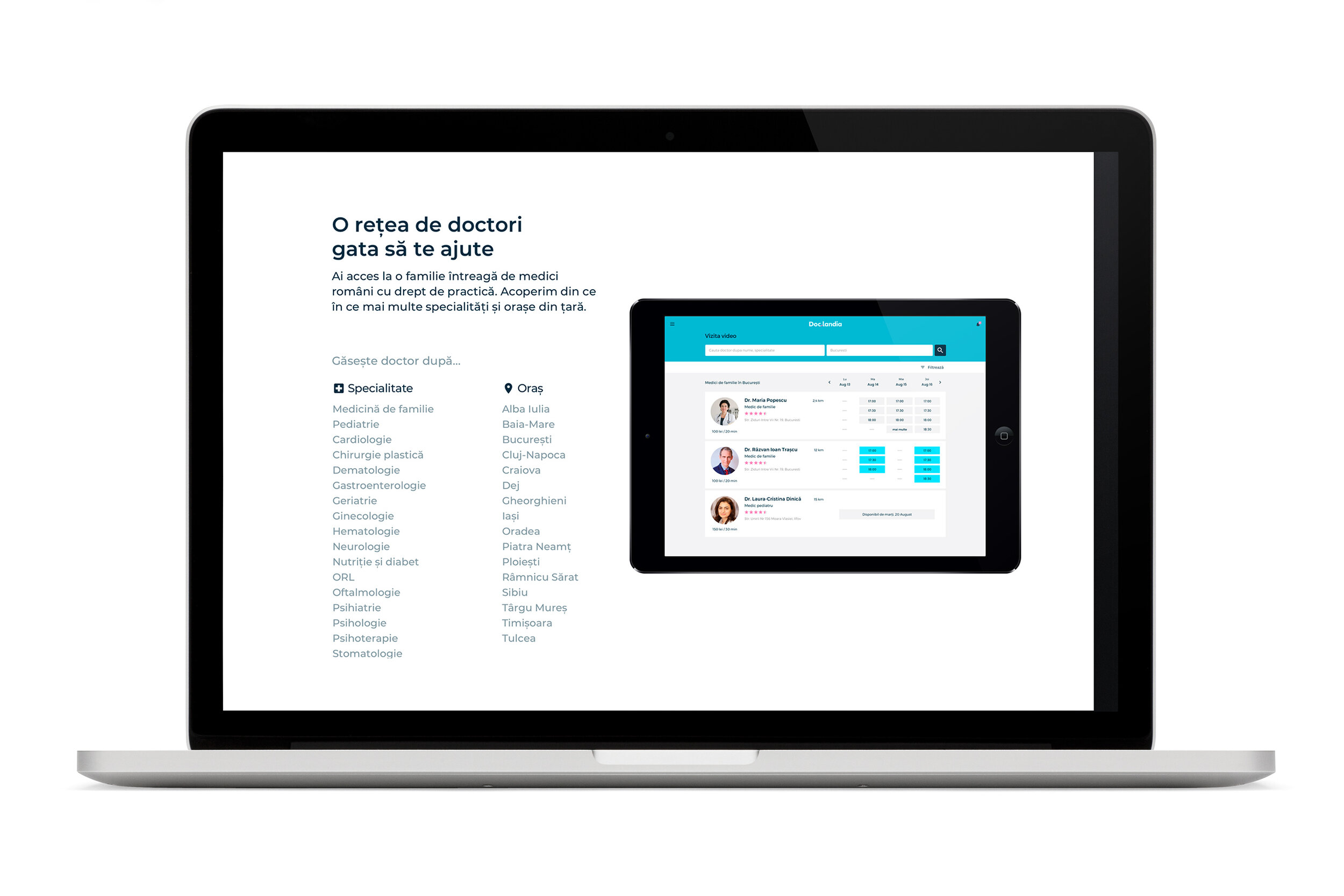
The part that got much of our attention was the video call, where we designed the entire journey from search to payment and beyond. That includes a lot of components, such as the doctor’s online office, where the patient can check out the doctor’s background and book an appointment. Or the actual video interaction, where we introduced the possibility to chat as well.
We also developed a section called ‘My doctors’, where the patient can quickly find the professionals he previously interacted with. Another key decision was to separate the patient’s health information from the regular account information in a new section that we called ‘Medical profile’.
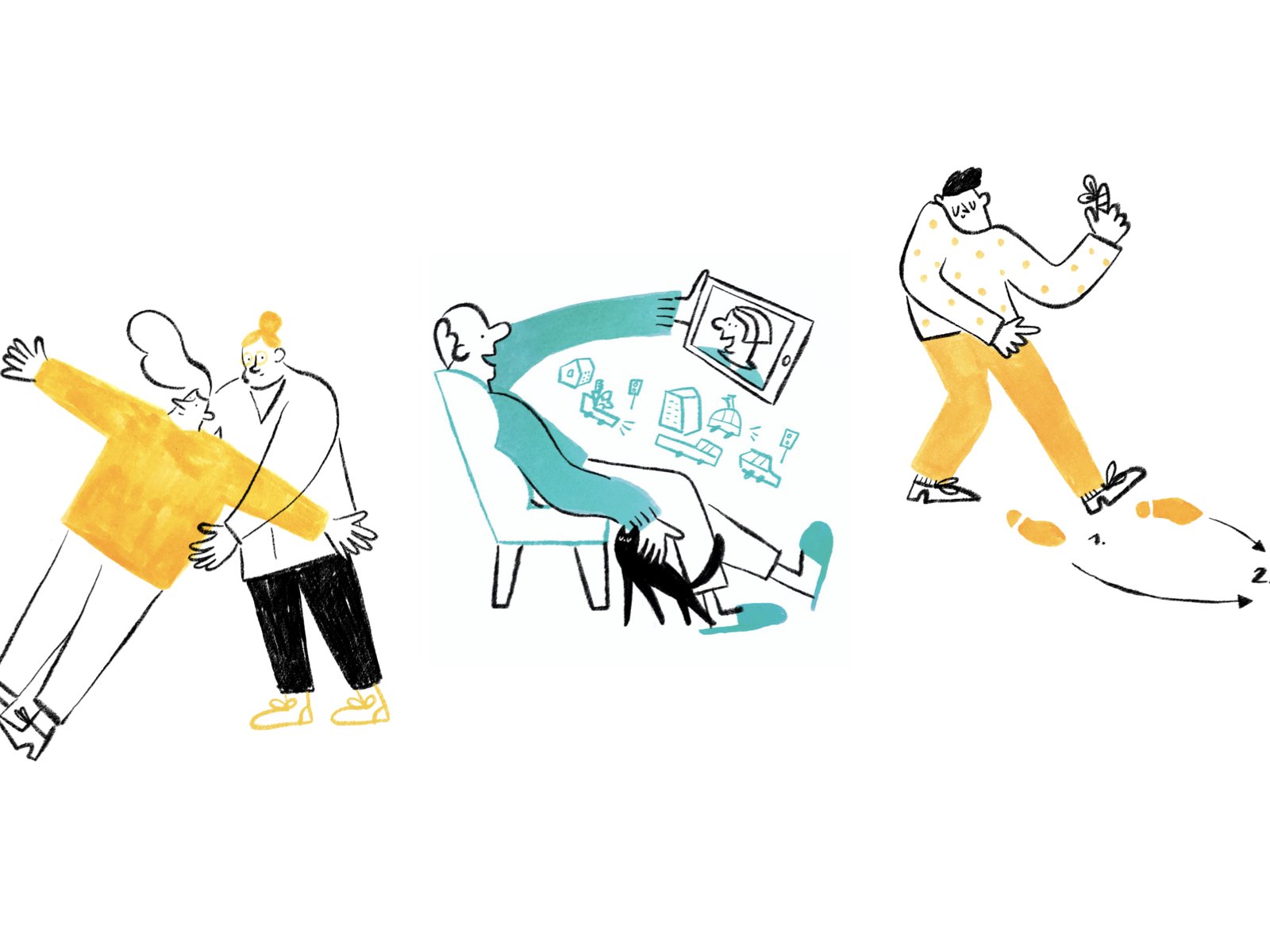
To help users understand all the improvements, we created a nice and easy onboarding. When they first enter a main section of the app, they get a few straightforward tips about using it, written in a casual friendly language. We introduced some engaging messages on the welcome screen too, for example to encourage patients to update their medical profile before a new consultation or fill it in when it’s empty.
The charmingly human illustration by Anna Florea at Rivulet played a big part in the onboarding experience. We wanted the visuals to look like hand-drawings, with imperfections that would contrast the rigour of the interface design. The technique combines a digital line brush in black with hand-painted fills in warm positive colours.
Doctor experience
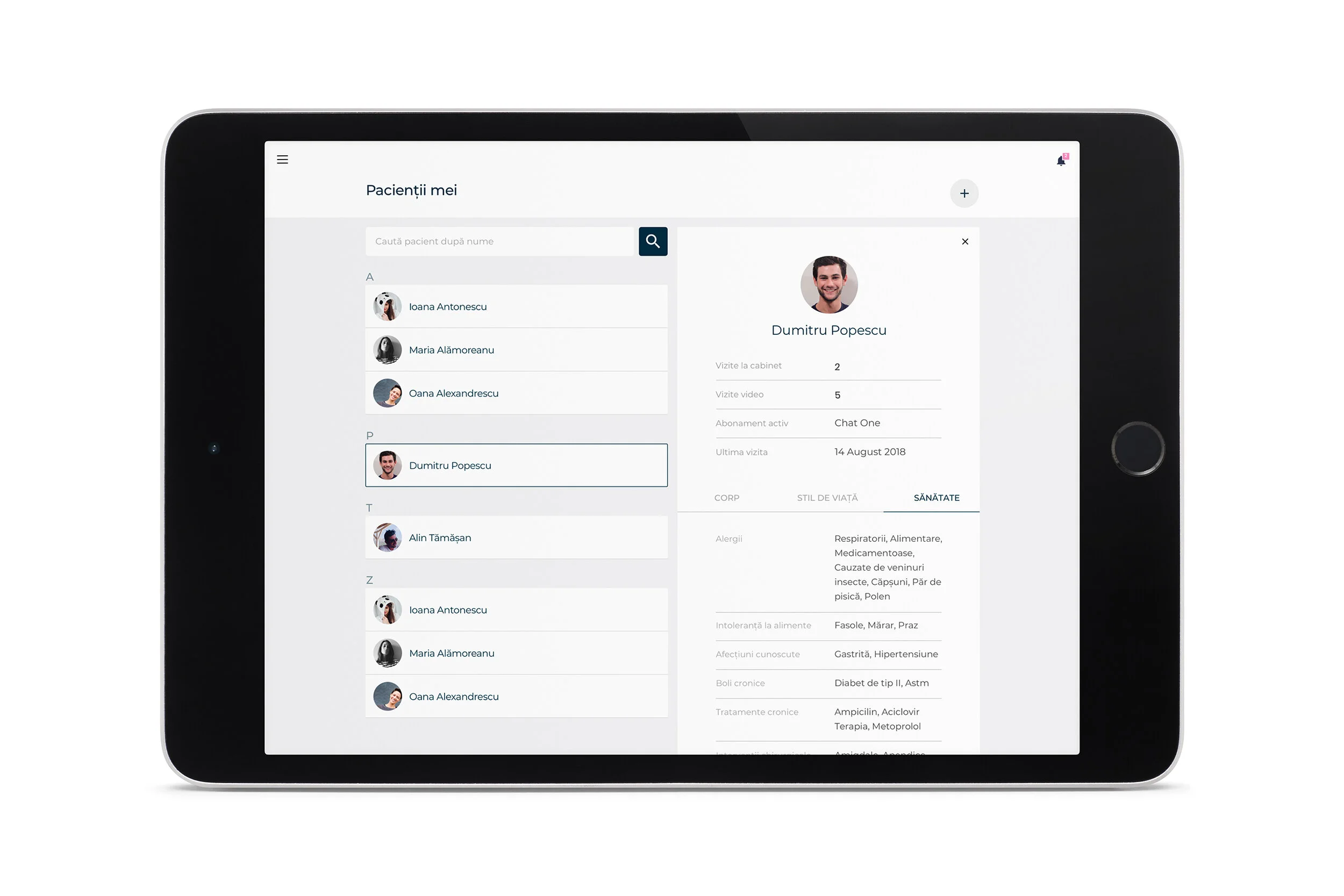
Everything had to mirror perfectly on the doctor’s side, but things were a bit more complex because one doctor has to manage three types of consultations and lots of patients at once. That’s why we created a proper calendar where the doctor can visually set his or her availability for each service and follow all the upcoming appointments. Also new here are the patient list in ‘My patients’ and the progress report in ‘Activity’.
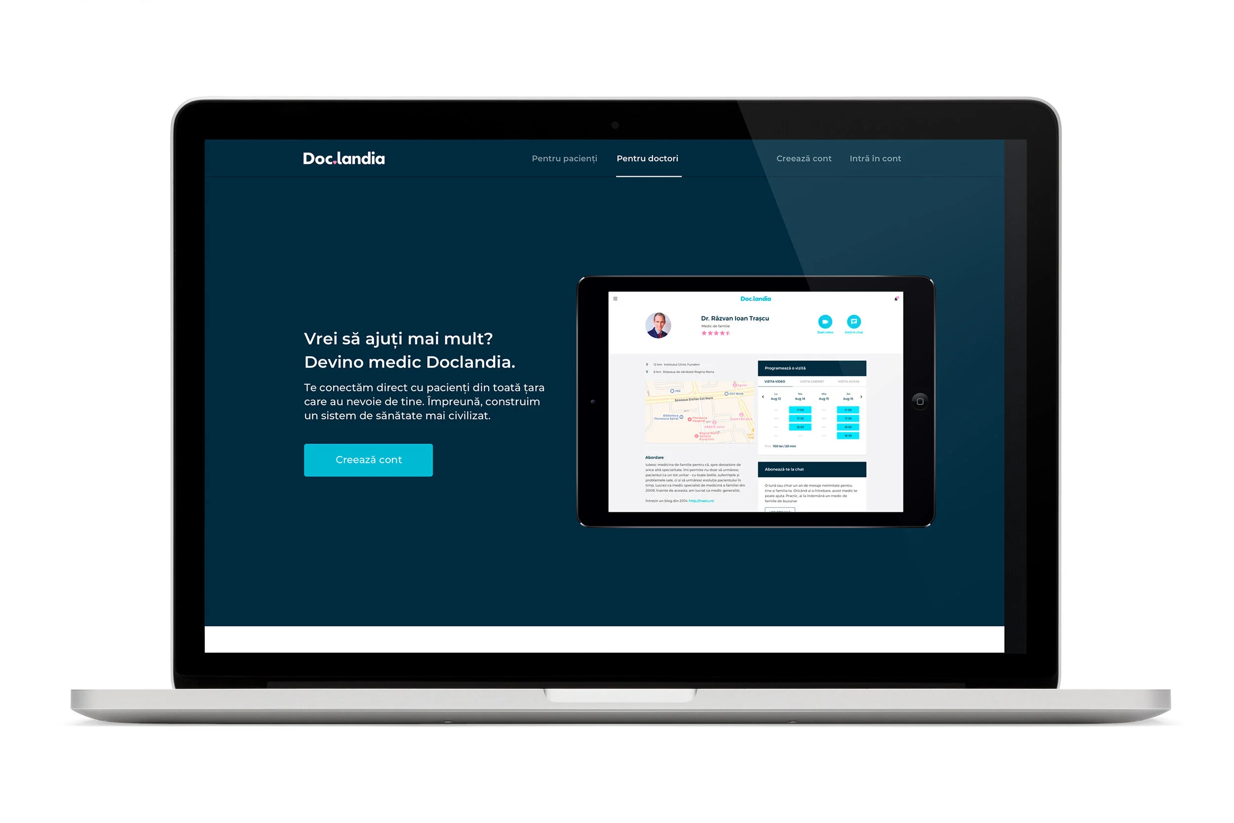
We outlined clear steps and guidelines in the doctor’s onboarding, in order to help even the least tech-savvy ones to overcome the initial account validation and to understand Doclandia as their partner.


