MOKI — Brand Strategy · Naming · Brand Identity
Modern Kitchen
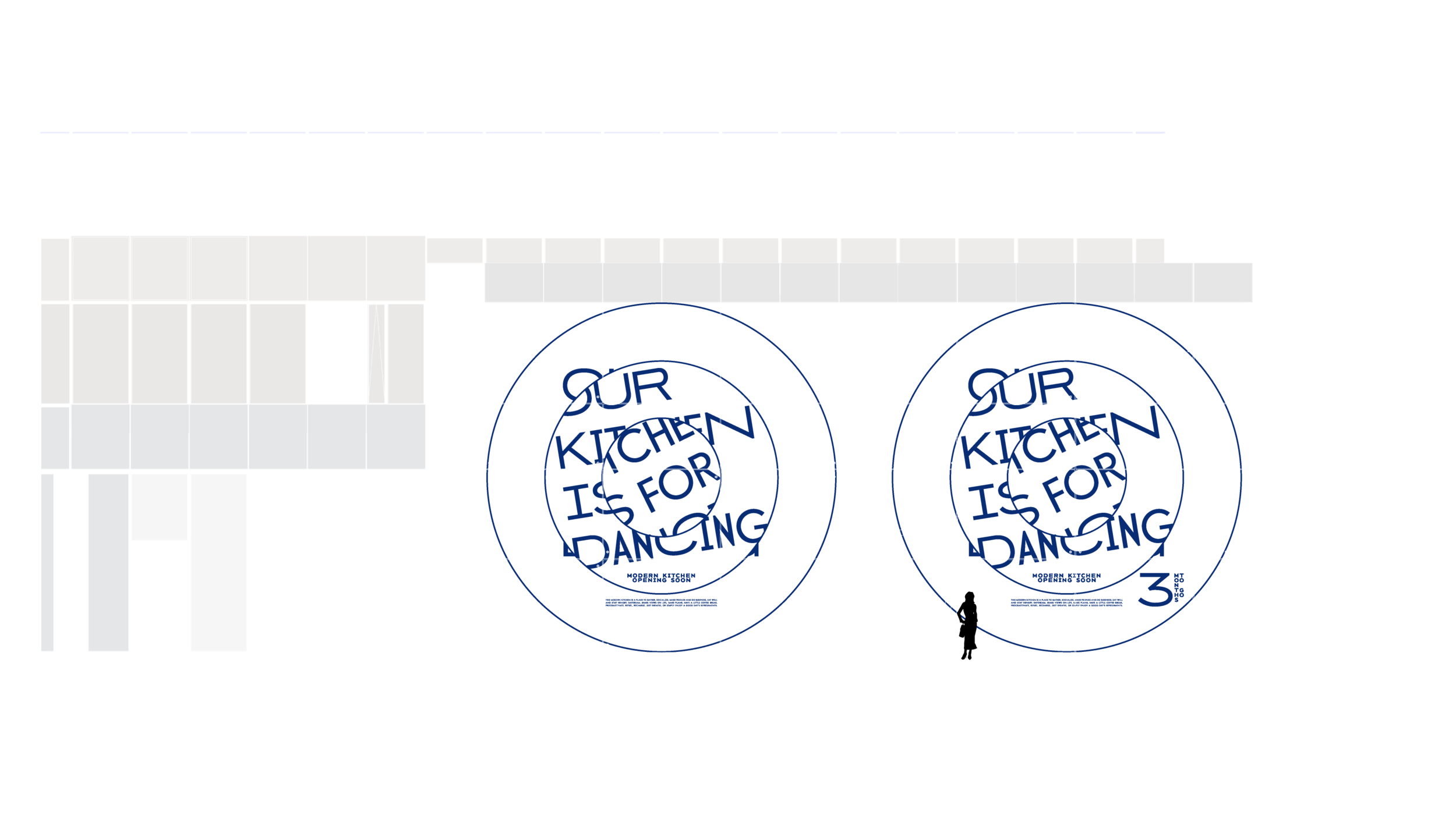
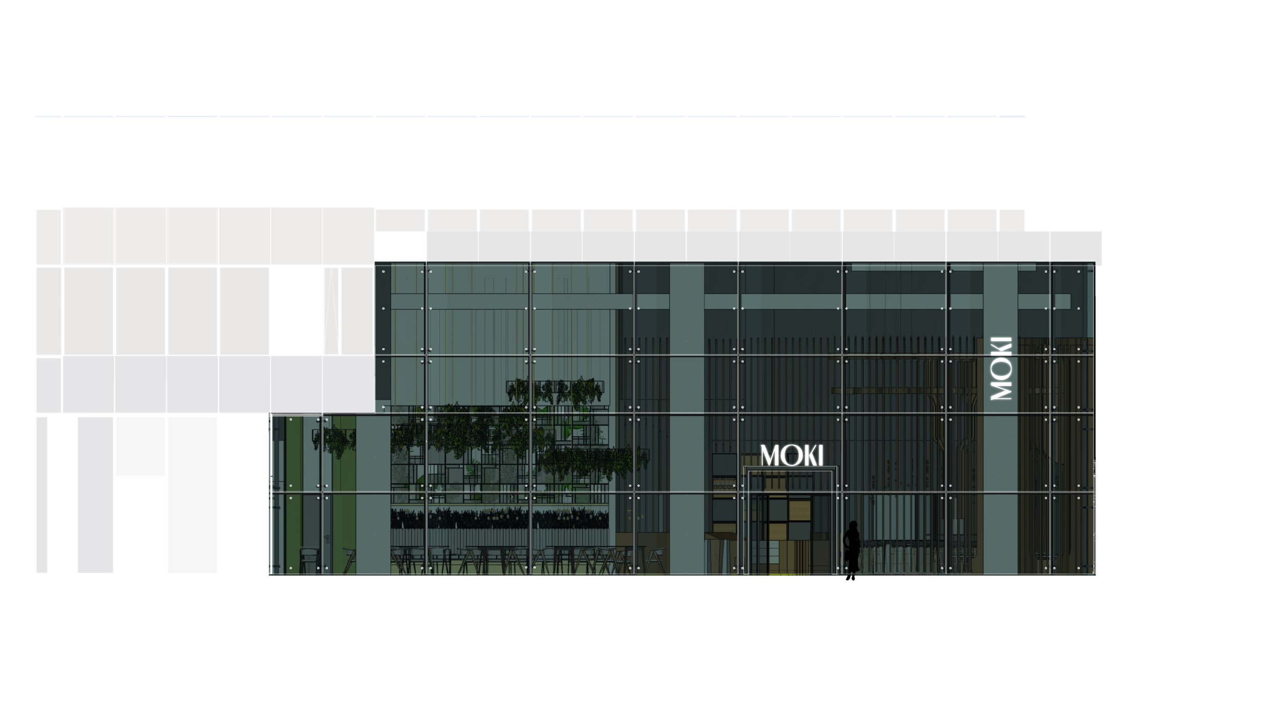
Moki comes from Modern Kitchen, a meeting and socializing place for busy people. Found in Green Court Bucharest, the restaurant offers a variable contemporary menu with best in class ingredients and recipes that are quick to eat.
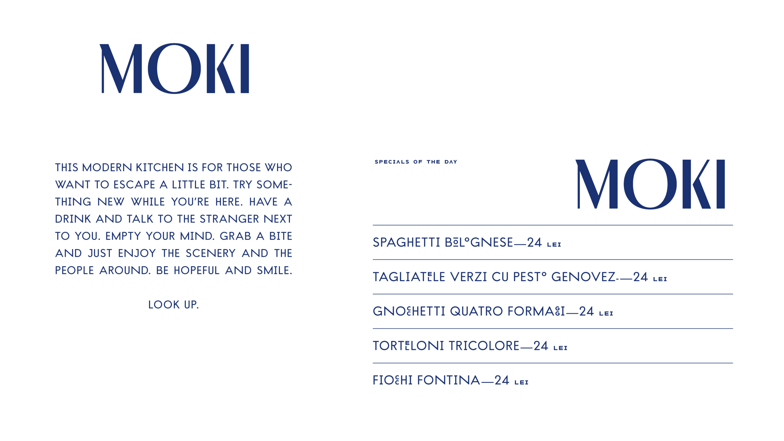
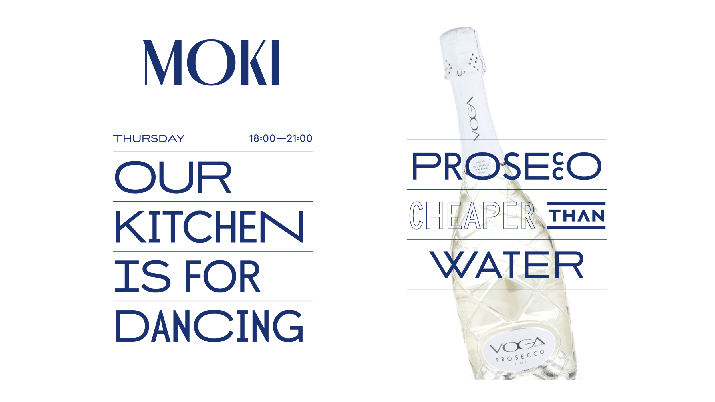
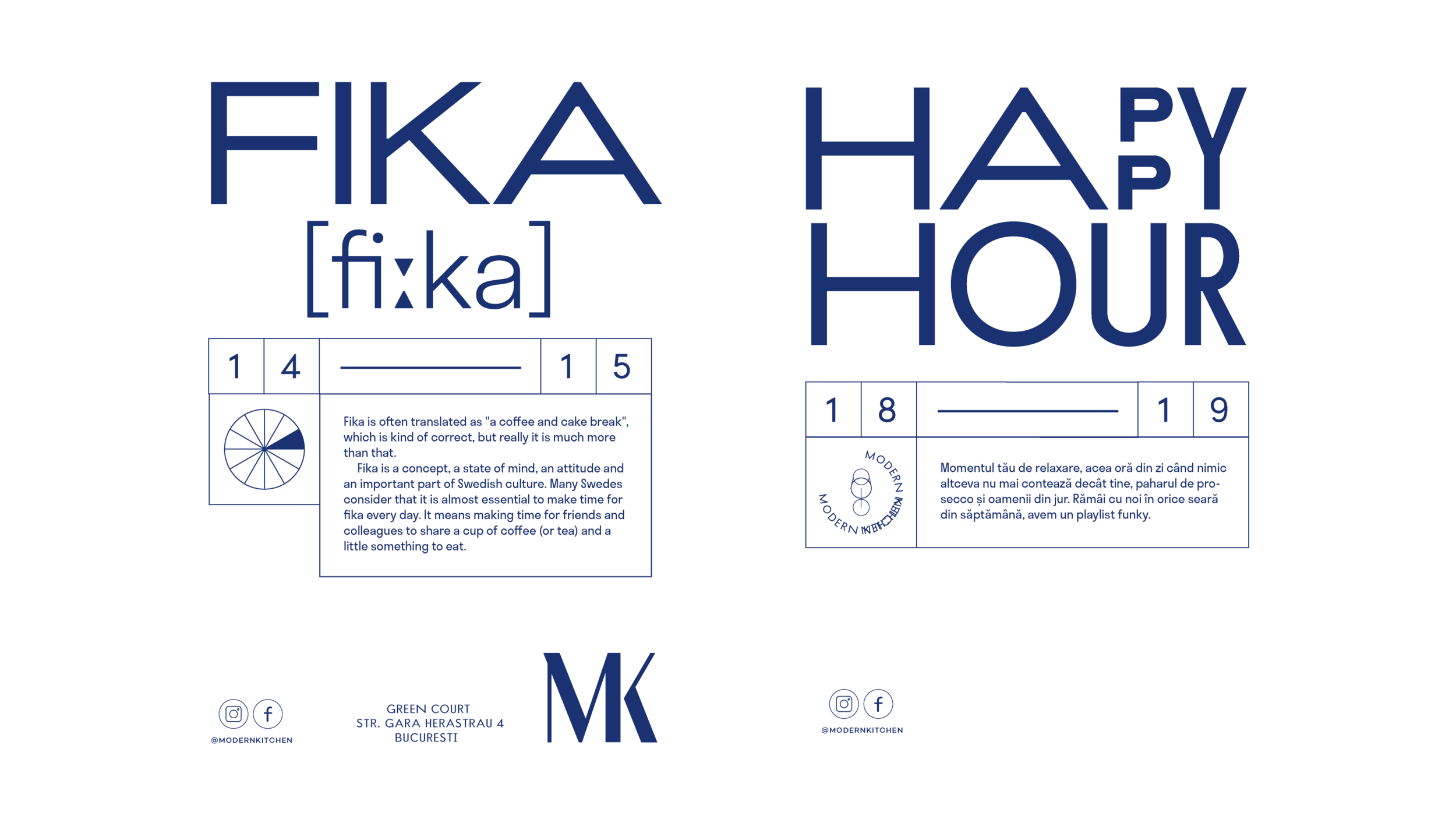
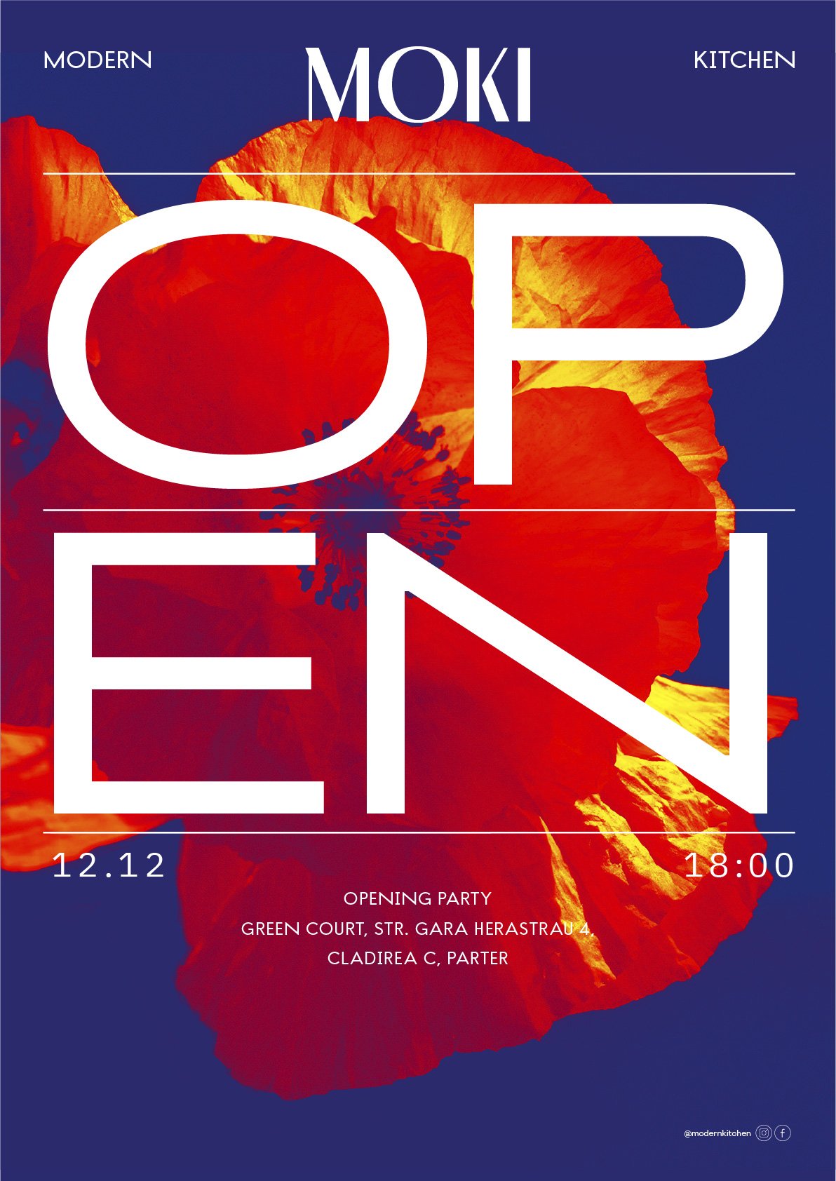
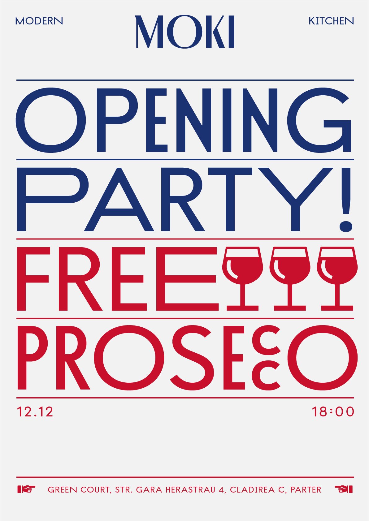
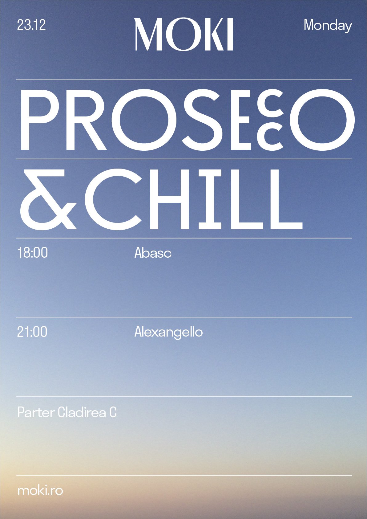
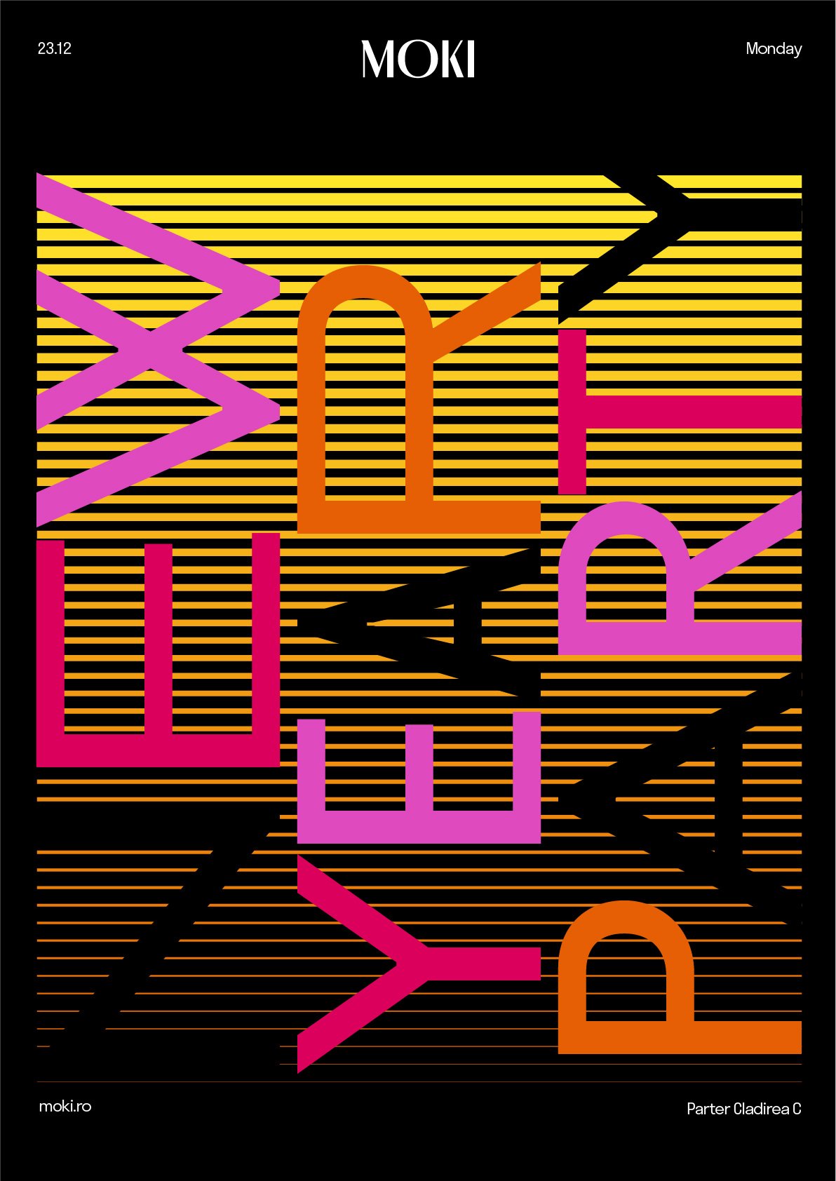
The wordmark is dramatic and refined, with a pronounced contrast between thick and thin, customized to go well with the tall and rhythmic feeling inside the restaurant. M and KI occupy the same space. The wide O marks the center of the word, looking like an open mouth that hopefully hypnotizes the viewer.
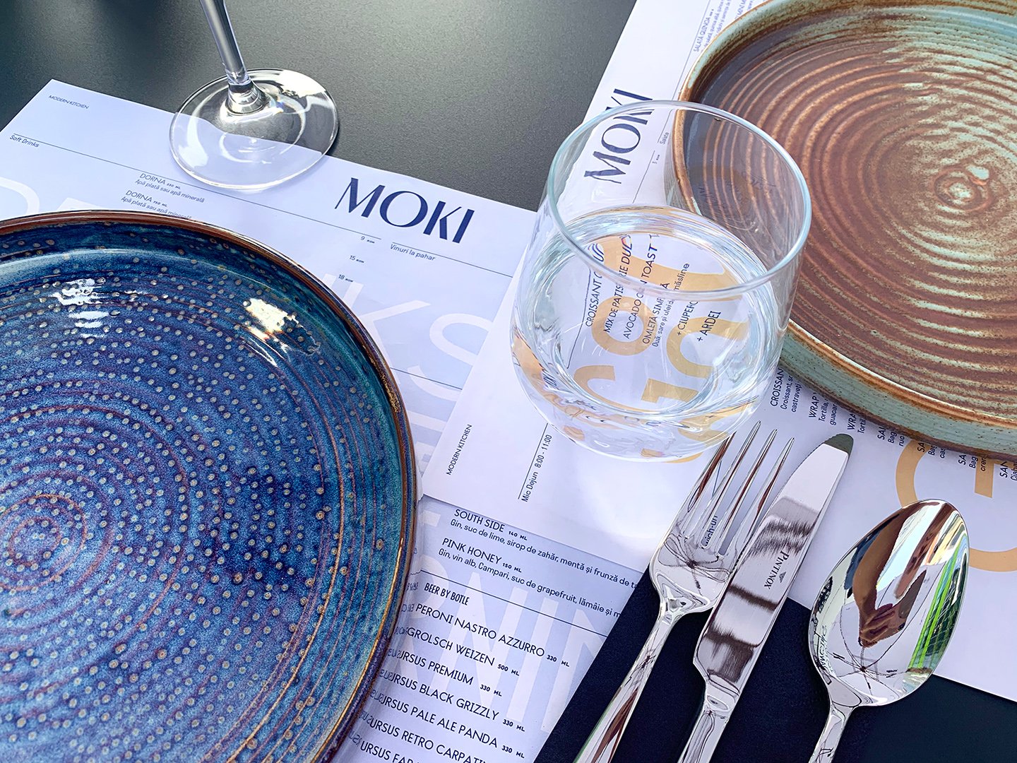
There’s symmetry and balance in the identity, but there’s also fun with the use of Helmut as primary typeface, with three widths and a foodie feel. The colour palette is minimalist and efficient, leaving room for the space to make an impression.
