QUICKMOBILE — Brand Strategy · Brand Identity · Retail and Website Design · Graphic System · Motion Graphics · Brand Sound
Where the smart things are
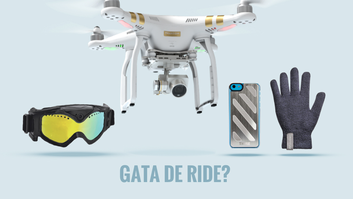
In the most dynamic industry in the world, we position Quickmobile as the enabler of a smart lifestyle, bringing all the smart tech that make millennials tick — drones, robots, the newest smartphones. Headquartered in Baia Mare, the business has a growing online platform, 14 shops, 200 people and €50M in turnover.
Quickmobile needed a brand that would both appeal to consumers and be easy to use by their in-house design team, so we combined rules and rigour with a bit of excitement. Ideally the new brand would also reflect the boldness and swiftness that set Quickmobile apart from other players.
Say hello to Q, the star of the show!
Symbol
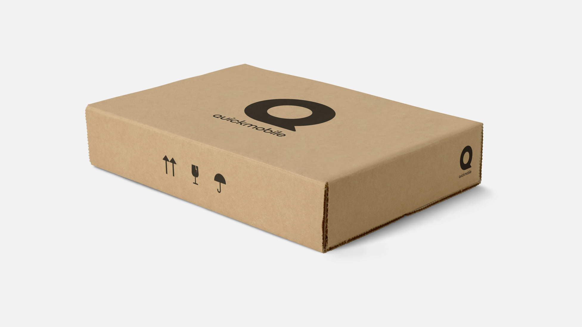
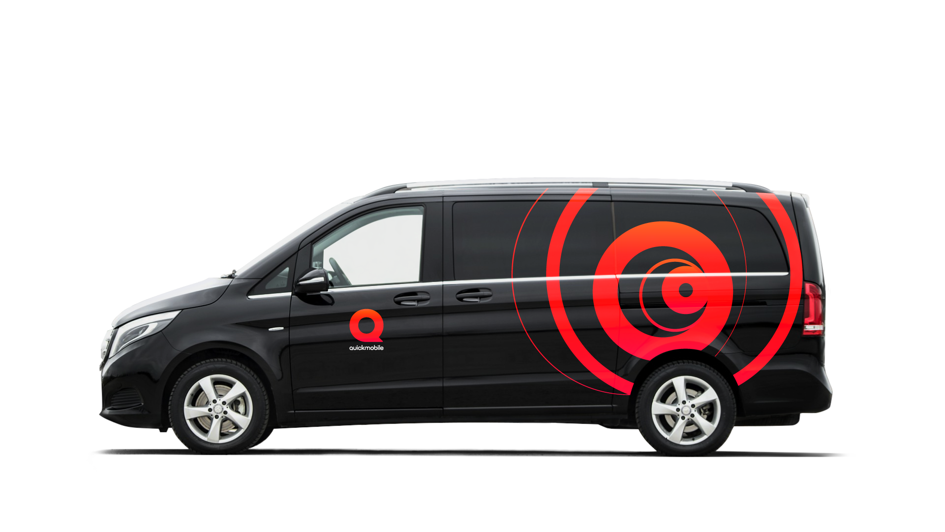
We reinvented the Q as a solid, iconic and contemporary shape.
Colors
Rubine red and orange blend in smoothly to give a lively gradient.
Wordmark
The custom typeface resembles the symbol, friendly yet cutting edge.
Online comes first for Quickmobile, so we added a little motion to the picture. Something nice and simple to sign all the regular videos. Credits for the motion and sound design go to our friends at Rivulet, who helped us get the quick and electronic effect that we wanted.
There's a high dose of black, white and greys in the overall look of the brand to complement the bright gradient. Q stands out!
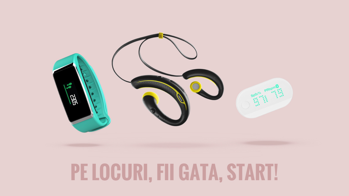
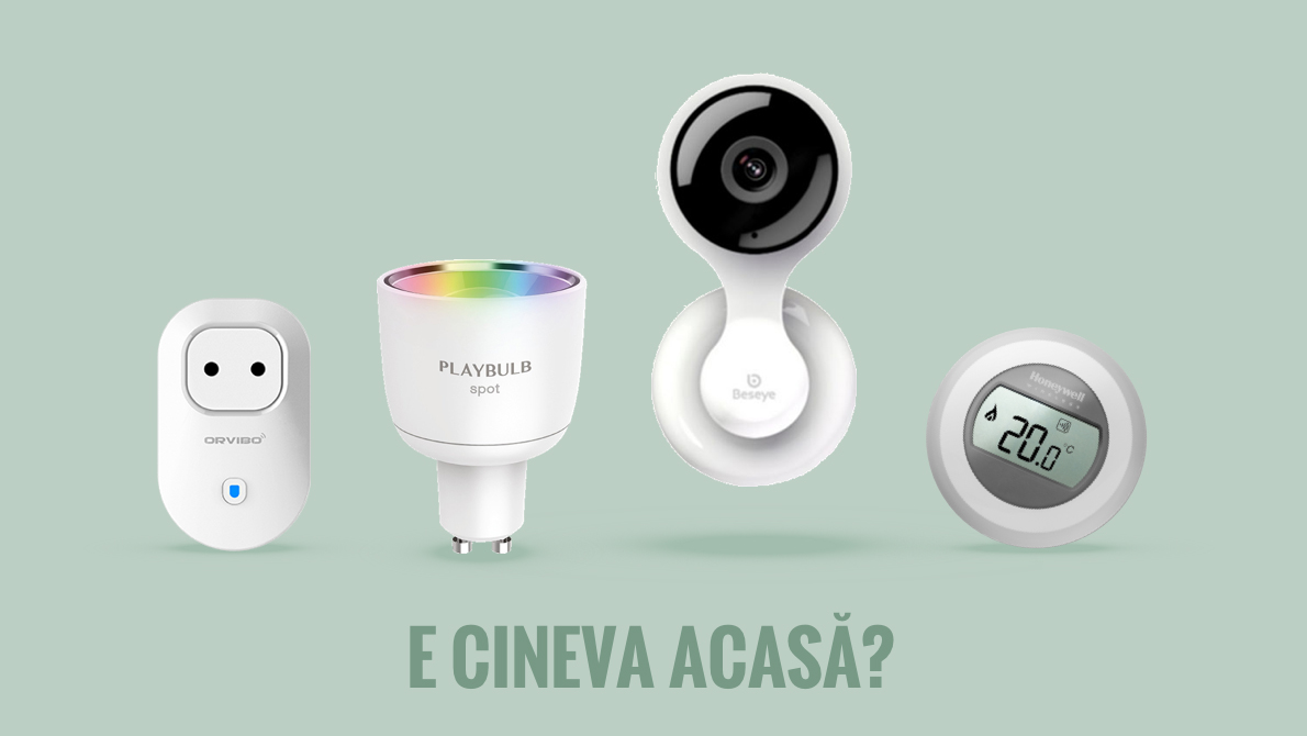
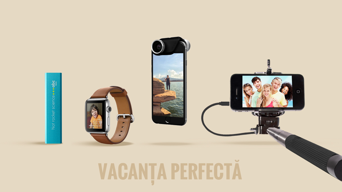
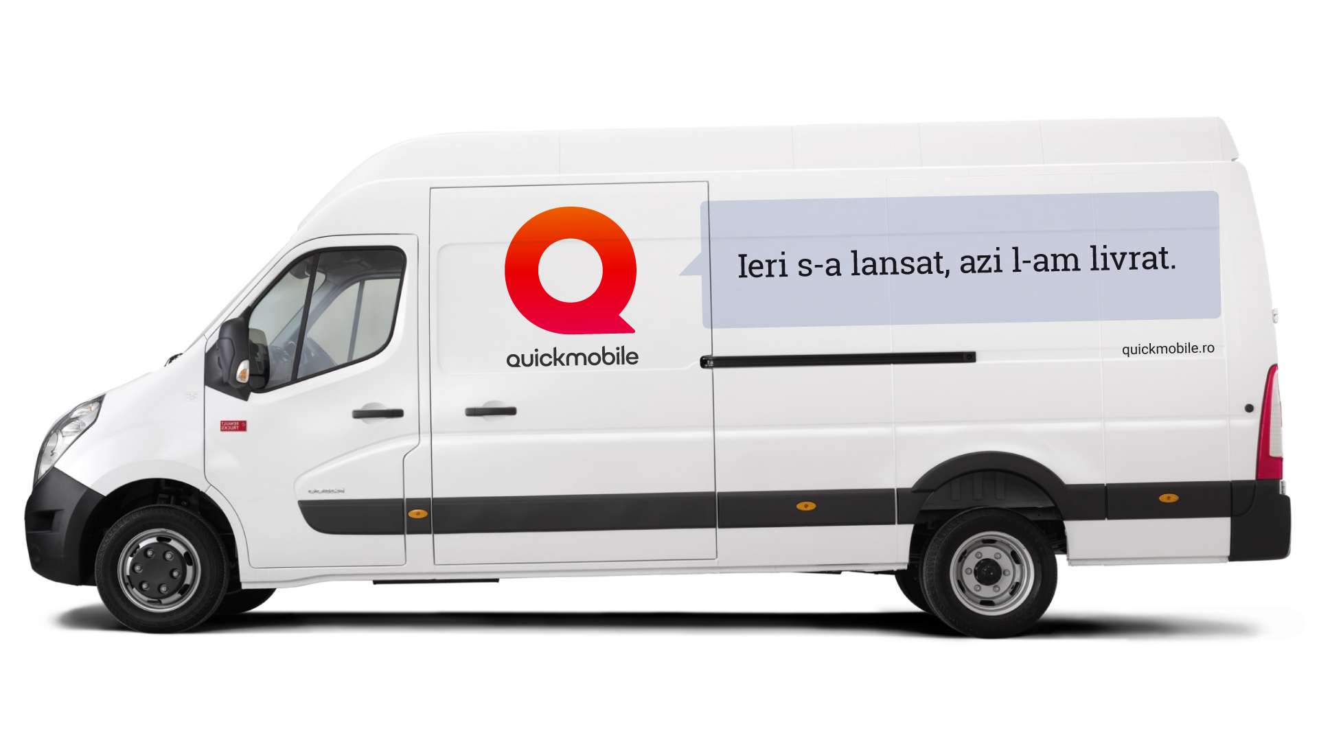
Most devices come in dark or light colors, so we introduced a series of pastel nuances as a secondary color palette for the backgrounds in communication layouts. We use the speech bubble whenever we need to keep the mark protected.
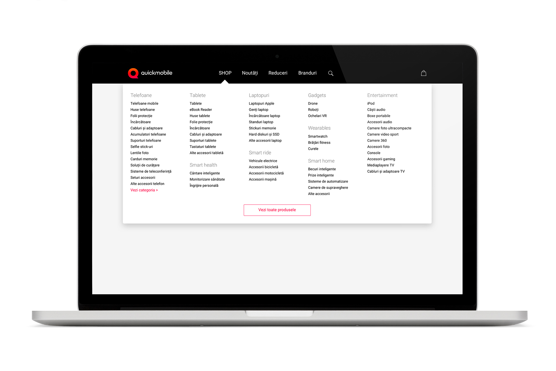
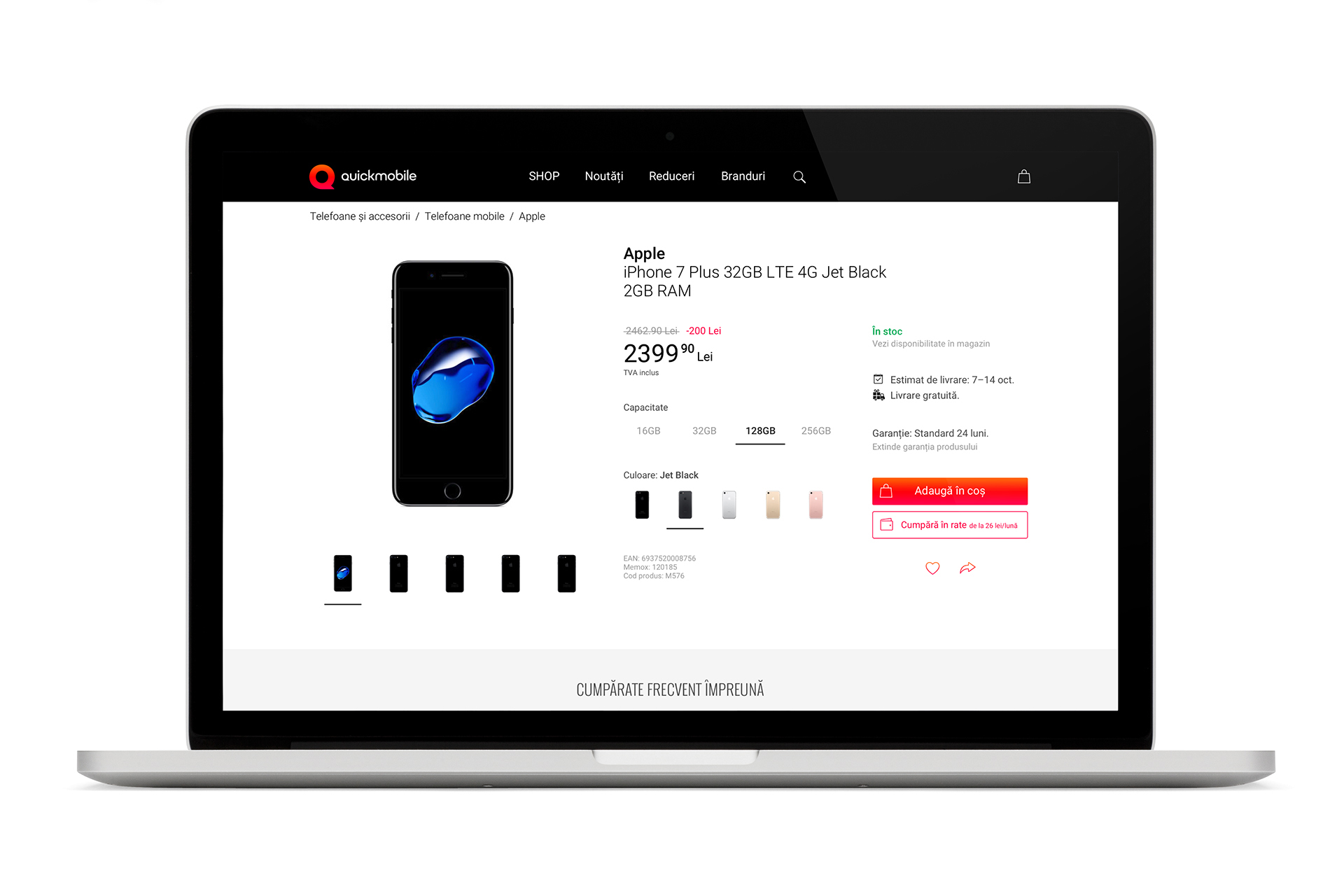
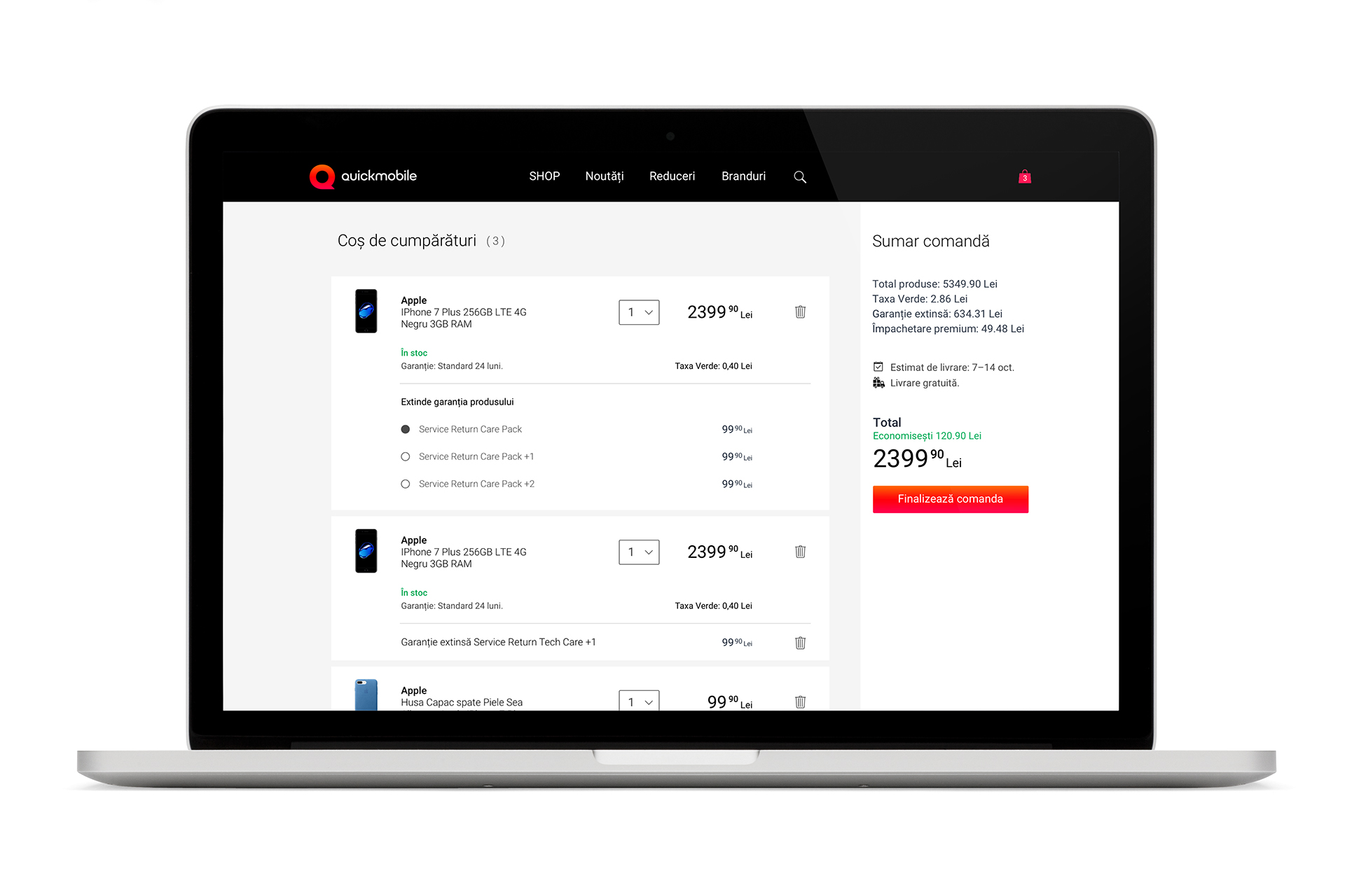
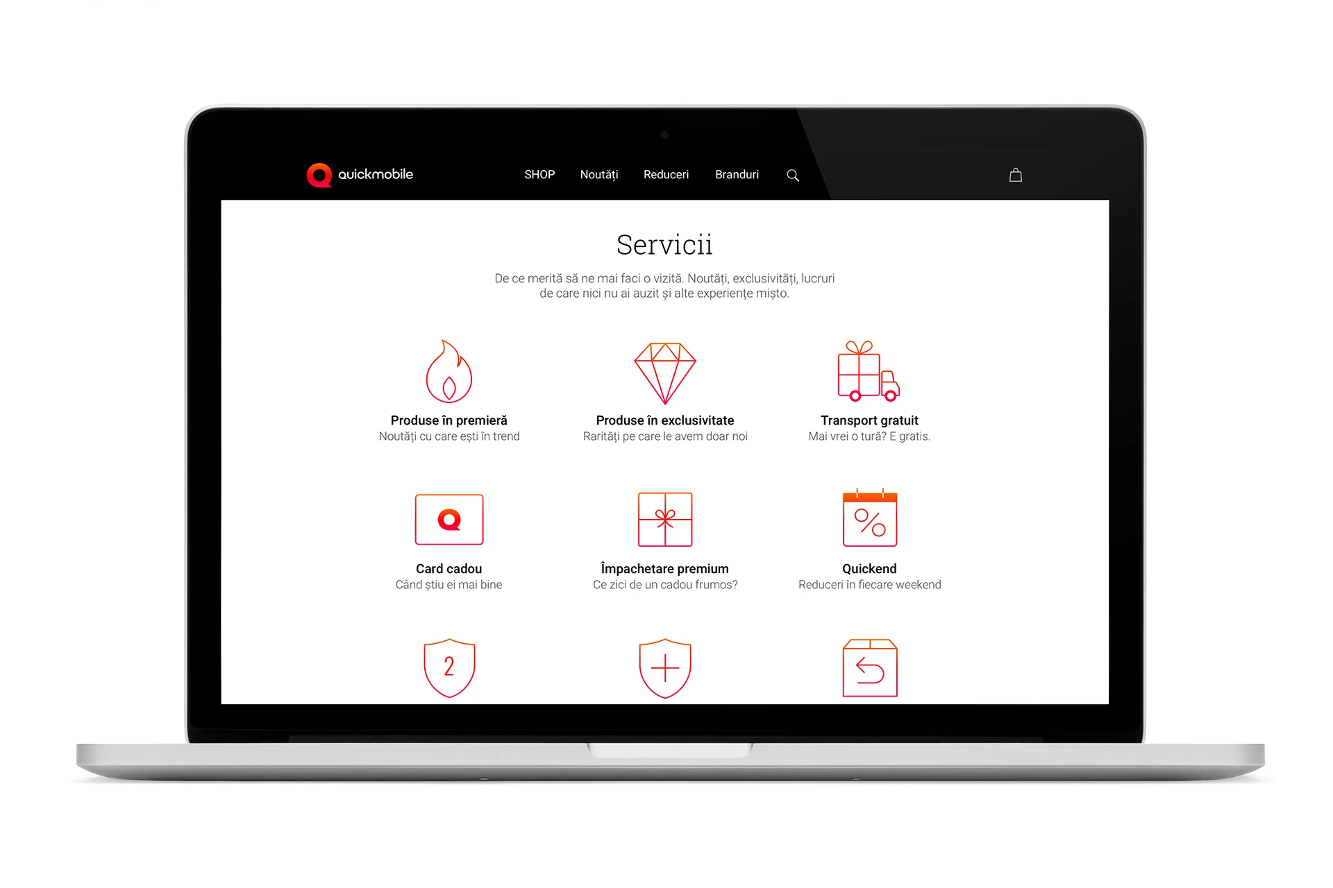
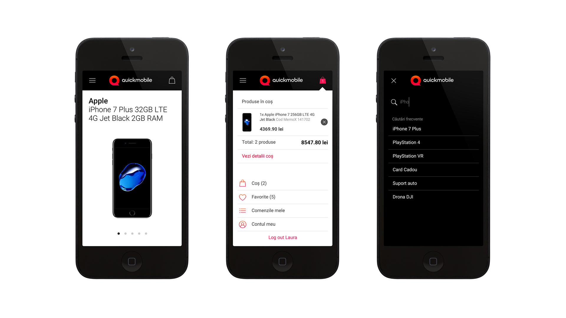
A faster navigation together with a clean and consistent look make the new online shop easy and enjoyable, from homepage to checkout.
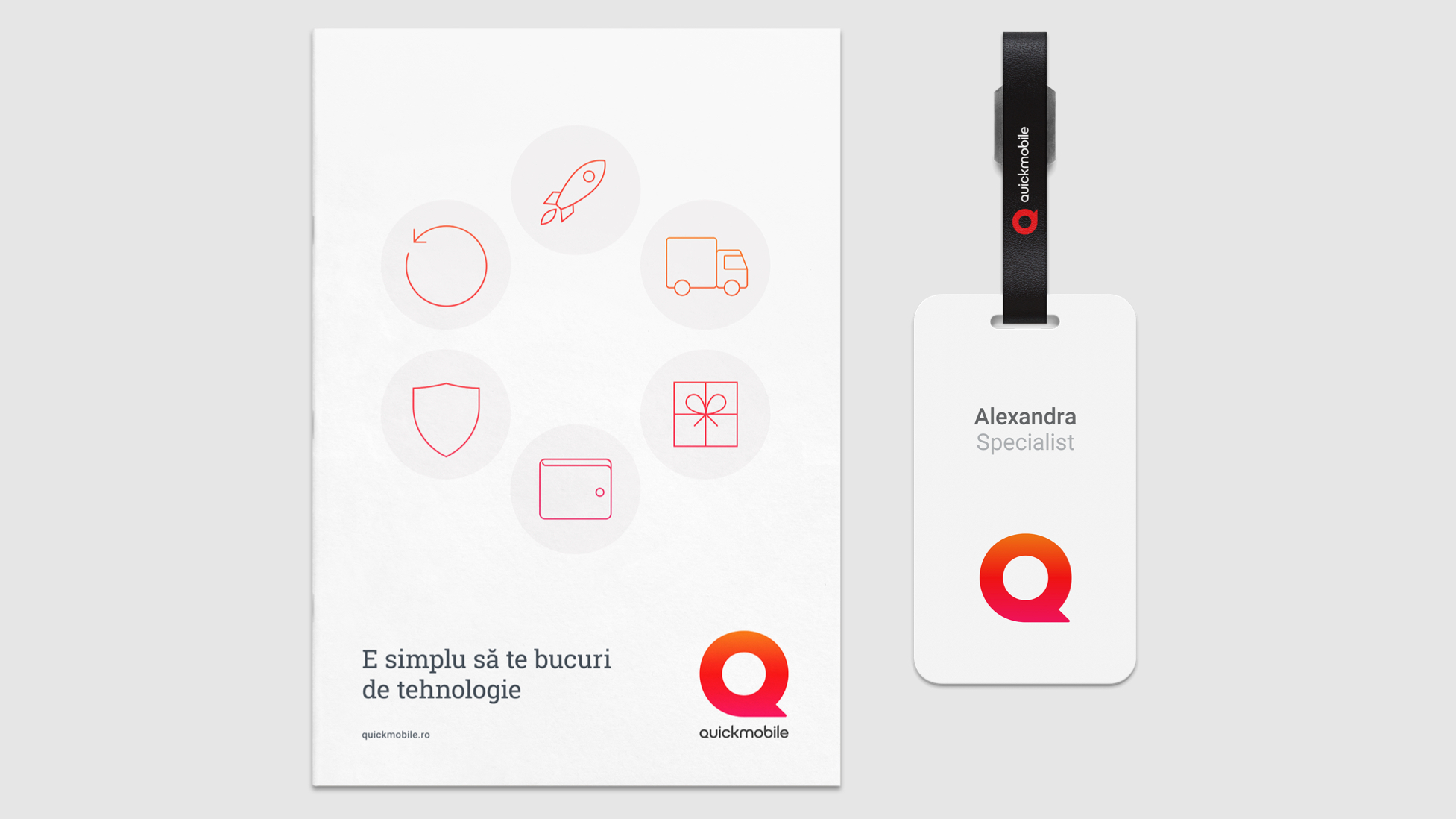
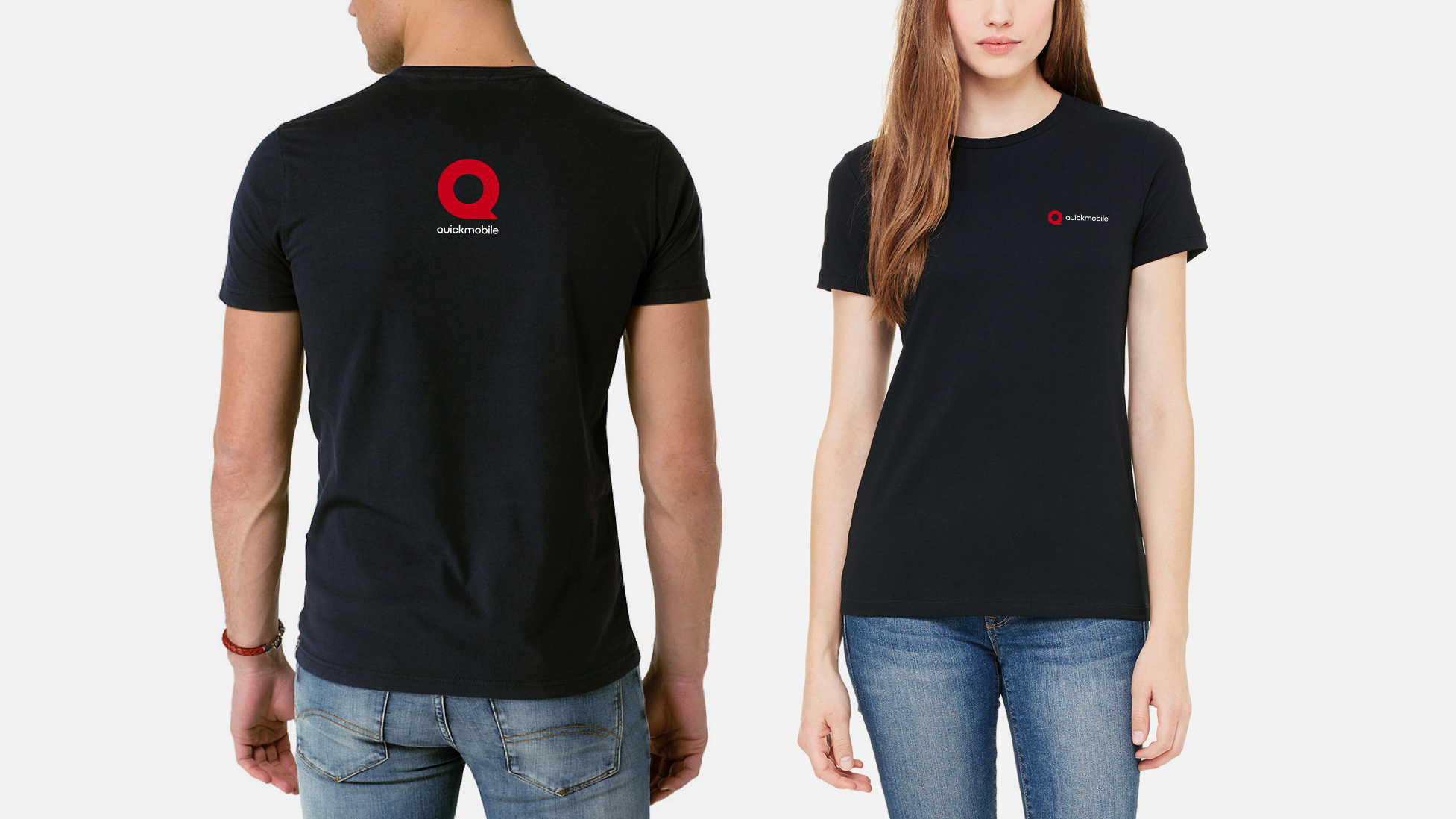
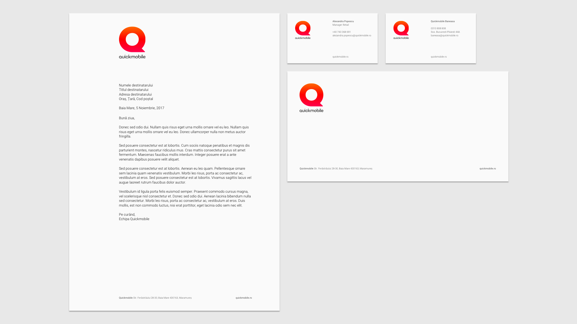
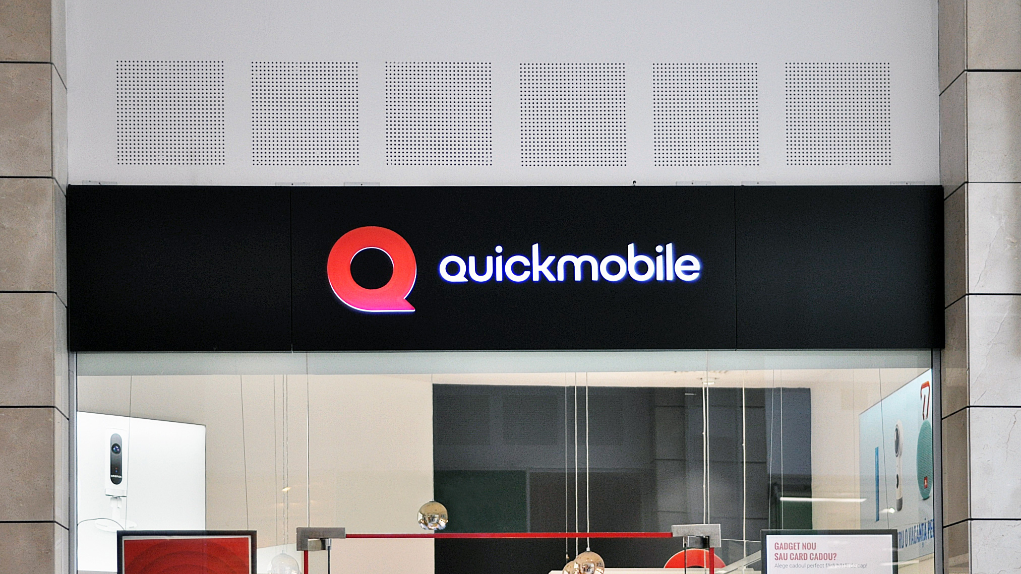
From online visuals to in-store materials, we took care of all touchpoints in the customer journey, aiming for a seamless experience. We worked closely with Quickmobile’s team of designers and communicators to help them make the most of the new brand.
“Partnership as it should be, with great involvement on both sides.”


