ZMEURINO — Naming · Brand Identity · Positioning · Packaging Design
Fresh picks
Zmeurino combines function and style for people who want to refresh their phone. We created this fun and brave name to describe the collection of accessories and gadgets it gathers — small and portable, fresh and new. The word comes from zmeură, the Romanian word for raspberry.
The name and the symbol form a compact signature that catches the eye. The symbol resembles a fingerprint, adding a tactile feel when debossed on products. At a closer look, you can also read a Z letter made of stripes.
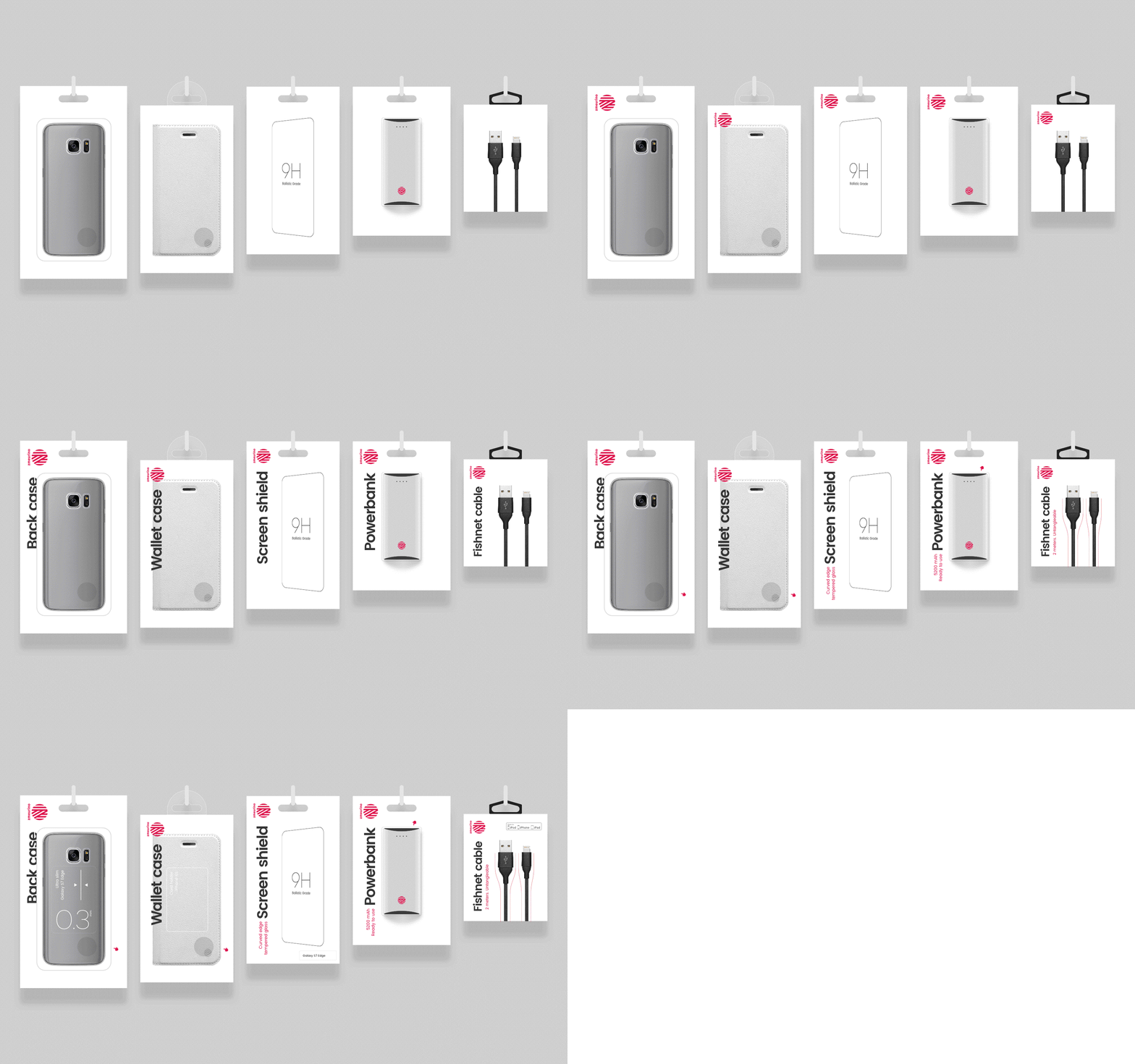
Packages vary from product to product with little space available, so we aimed for an overall unity and efficiency. The key feature interacts with the product to save space while adding more personality to the brand. We used a manicule to indicate that you can touch the case or check the powerbank battery level.


